Friday 7 March 2014

2nd draft vs final music video comparison

2nd draft vs final music video from Hannah Alley on Vimeo.

This is another piece of work I was not obliged to do, however I felt that it was necessary to show a final comparison between the second draft of my music video, and the final version. I did this by downloading my 2nd draft through www.keepvid.com and importing this video into Adobe Premiere Pro. Then, because I already had my final video handy, I imported this straight onto Premiere too. I placed both videos on to the timeline and resized them both so that they were next to eachother in a suitable place.
I feel that this video presents a really great comparison between my 2nd draft and final video, and it portrays the progress in which I have made with my production. You can even see from the still image that my final video is just in general a lot brigher, colourful and contrasting than the second draft. However as you watch the video, you will witness the many changes in which I have made between them both.

"Guns and Horses" - Ellie Goulding final music video

"Guns and Horses" - Ellie Goulding final music video from Hannah Alley on Vimeo.


This is the final product of my music video, in which I have made many changes to my second draft to improve it greatly. Firstly, I have colour corrected all of the shots by adding a long adjustment layer that goes through all of the shots, which I then added an 'auto colour' effect to. I found this made all of my shots a bit brighter and more pleasing to the eye, therefore more professional. I also added a shot at the beginning that pans down to the floor to ensure I not only have a variety of camera movement, but so that I could match the shots to the beat/Ellie's voice a bit more. To make my music video better, I have really taken notice of all of the feedback I've received and improving on the aspects/criticism mentioned. A prime example of this is when someone said that on one of the shots of Georgina's feet walking across the woods ground at the start of the video, 'her feet move too slowly in comparison to the long shots of her walking a little bit faster before and after this'. So, I increased the speed of this shot of Georgina's feet walking, to about 160%, and compared it with the long shots of her walking before and after this. I found that they now matched, and the scene looked a lot more realistic. Then, I added an adjustment layer to all of the narrative shots which essentially made them all brighter, and the contrasts a lot darker. I figured that the previous effect I'd added to the narrative shots was not effective enough; when I'd asked for feedback on the second draft, people had said I needed to colour correct some shots, which made me assume that the previous effect made the narrative shots look too dull and did not have the right effect/success, so I knew I needed to change this. The new effect I've added to the narrative shots ensures that there is a strong contrast between the performance and narrative shots, so that the audience can identify what are flashbacks, and what is not. The second feature I have changed in my music video is that I have changed the pace, cut and rhythm of the shots greatly. In the second draft of my video, some narrative parts matched the beat of the song and some narrative parts didn't. However I have changed this so that all narrative shots match the exact beat and rhythm of the song, and it is pleasing and fluent to the human eye. I did this by 'matching' each beat onto the timeline of my video, and cut each shot to this. This was quite difficult because I had to get each shot at the exact right time, which meant I even had to search for some more footage in my files and add more shots to perfect this. But I found the overall image really successful, as now, it flows naturally and matches the beat perfectly. I have also added a 'sharpen' adjustment layer throughout all of my shots, to ensure that all shots look professional and as sharp as possible. I found that the footage looked a lot better after I had done this, as according to my audience feedback, some shots were blurred, and I knew I needed to fix this.
Furthermore, I've added more interesting and quirky effects to my music video in order to ensure that it stands out and looks different and enticing to the eye. Sometimes 'love stories' in music videos can come across as cliché and 'the same', so I wanted to really avoid this. Therefore, at 00:56 seconds in when there are narrative shots displayed of Georgina putting on her coat and leaving her house to go and meet Matt, there is now an overlay of a performance shot of Georgina singing the lyrics displayed at that moment in time, which is faded into the narrative shot slightly. You can see the narrative shot more than this shot which is the idea - I changed the opacity of the performance shot so that it is slightly seen. I have also done this for about three other shots throughout my music video, either to represent Georgina's emotions - for example at one stage, I added a faded shot of Georgina looking down sadly, over the top of a shot of Georgina running through the woods - or to just show different aspects of the video and like I said, keep it interesting. I also did it to remind the audience that Georgina is still performing on the outside of this narrative.
Additionally, I have tried to make use of all of the footage I have taken to make my music video more interesting and varied shot-wise. Therefore, I added a shot about 01 min 23 secs in of Georgina's eye-view of what it looks like in the woods ahead of her. The camera is moving as if she is walking and the view is of her eye sight. I found this would be effective in showing her point of view, like I do with many other shots throughout the video. 
What I have also done is change the colour of the slow motion gymnastic shots in the video. Before, they were black and white, but the more I watched my video, the more I found the black and white a bit cliché and normal. I want to stay away from my music video being completely conventional and predictable as possible, so I changed the colour to a light pink colour instead. I did this ask light pink connotes love and passion, which is exactly the emotion Georgina conveys throughout my music video.
There's not a lot I changed about the climax part of my music video where all the shots fasten up, as they all originally matched the beat of the song as I tried to do this very carefully and accurately, as well as the fact that this was the specific part I got a lot of positive feedback on in my survey. I felt that if I made too many changes to this, it wouldn't be what my audience wanted, so I left this.
However, the ending part of my video I really did change. For starters, in the shots of the letter being found and then burned, I colour corrected these with a 'colour curve' effect and increased the green and red curves in the shots, as I found they looked better this way and they also conveyed a more passionate emotion. Then, after receiving the feedback that the ending of my video was too confusing with Georgina smiling happily as she sung the last lyric of the song, I completely changed this. I agree that it was contradicting as throughout the whole of my video she'd been sad and heartbroken, whereas at the end she portrayed the complete opposite of this. So I replaced one of the shots with a slow shot of the camera panning across the ashes left over on the floor from her burning the letter, and sped it up a bit, and then left the shot of Jess' gymnastics in black and white as I found it more memorable and meaningful this way, and then I added a close up shot of Georgina looking sad, so that the audience could finally empathise and identify with her. Then, on top of this I placed a shot of Georgina and Matt standing in a field cuddling together, as their last moments together. I made this black and white so it had a sentimental affect, and changed the opacity to about 30% so that it faded into the close up shot of Georgina looking sad. Therefore, the two shots were very contrasting as Georgina's hair is colourful and bright red to signify passion and pain/anger, in comparison with the sad, black and white shot of the couple's last moments together. I found that this was the perfect final shot for my music video as the merging of these two pieces of footage gave off the effect of the audience actually knowing what Georgina is thinking about in this final shot of her looking sad, because it is represented faintly on top of her - reminiscing of her and Matt happy together. I actually found this shot of Georgina and Matt right at the start of the footage I'd taken for my music video, when I was filming Jess doing her gymnastics. The purpose wasn't even to film Georgina and Matt at this stage - I was actually filming Jess practicing her gymnastics - yet I just happened to pan over to Georgina and Matt cuddling together. Therefore this was actually a natural, unplanned shot that they happened to be doing without us even organising it, which is the more touching part for me. I therefore wanted to incorporate this into my music video, because it's also a different scene; the wide field they are in represents the more happy, freedom-filled days the couple had together when they were in love.
Overall, I am pleased with the final product of my music video, however I will add changes to it in the future. For example, I know that the end of the video needs to go on for longer as it finishes quite abruptly, when really I want the sad effect to prolong for just a bit, so it can slowly fade out. I only realised this once I had published the video.


After creating the third draft of my music video, I knew that I had a lot of changes to make. So I got started on these right away. First of all, I fixed quite a lot of my shots in terms of colour correction, as I needed shots brighter and more contrasting in terms of colour. Also, I noticed that I had not placed the same adjustment layer to every single narrative stage/shot, so I fixed this by ensuring that every single narrative shot was the same in terms of colour. After watching over my third draft I also realised that there was a slight delay at the start of the music video with Georgina's miming, so I simply dragged the piece of footage along the timeline just a tad, and fixed it with what time it needed to play. Overall, I am really pleased with the final product of my music video. I feel as if it has an actual easy-to-understand love storyline, with added emotional depth to it, which I feel is a prime and crucial element in a music video.

Advertisement and Promotion


These posts focus on promotion and advertisement, and they highlight just a few ways in which I could advertise my album advert. This is through a billboard, a bus stop poster and an article. This is because I believe these are areas in which my target audience will notice my posters and therefore will be most effective/successful. For example, the bus stop suits my demographics being BC1 which consists of junior managers etc who are more likely to use public transport, as they may not be capable financilly, of running their own car.
I found the three advertisement images on google, opened them in Photoshop seperately, and imported either a landscape or portrait version of my album advert, in which I would then incorporate the image into the photo by cropping it or resizing it. I did this in order to make it look as realistic as possible, and give a professional view on what it would look like.
Billboard
This first image represents what my advert would look like blown up on a billboard. Personally, I believe that size is an extremely important factor when it comes to making a product appealing to the audience and engaging them. Even if the artist or pop genre does not interest the passer-by or driver that happens to see this billboard promotion, it will still catch their eye due to the size of it, and just with that fact, we can see how crucial a billboard really is. Therefore, this allows the identity of the artist to develop and expand due to the improvements in recognition. I believe that making the artist's appearance and recognition as large as possible, is the main selling point when advertising. This is because the intended target audience are then likely to identify with the artist. Therefore, using the billboard as a method of advertisement can be linked to Andrew Goodwin's theory with personal identity, as an individual or group may primarily purchase the album due to having a relationship or relation with/to the artist. Furthermore, I believe the billboard is a great way of advertising because my target audience would see it; - whether they are 20 and driving, or 16 and on a bus or walking by.
Bus stop advert
This second photo portrays a rough idea of what my advert would look like on a bus stop advertisement area. Similarly to the billboard, I believe that having an advert in an area like a bus stop is an extremely effective and successful way of promoting my album advert, and this is because is would attract a large target market from a diverse environment. Whether it be passers-by, members of the public transportation or people in their cars, a wide and varied target market from a range of cultures and ethnic backgrounds would see it. This leads to the idea that my advert could potentially appeal to a variety of cultures. Similarly, the majority of bus stop adverts are at eye level, so the individual who sees the advertisement have more of an ability to spend a lot of time viewing the information stated properly, allowing them to even take notes on it if they wanted to.
Article/magazine advertisement
For this advertisement technique, I actually wanted to find an original article about Ellie Goulding, so that it represented my actual artist more. It took a while for me to edit my advert onto the image as it had a lot of different features to the original image that I could not just place my advert over, so I had to cover up parts by placing a white-filled shape. However, I am pleased with the result as I believe it is fairly realistic. I understand that for space, the producers of the magazine may have wanted to leave the image to the left however if I was creating an article, I would ensure that the main image takes up the whole page as it would catch the reader's eye more and keep them engaged, because their eyes are constantly referring back to the image even whilst reading the article - this is to do with Goodwin's 'star image', because essentially, Georgina/Ellie is the main focus of the product. Because essentially, the reader's interest is now being met, this would refer to the purpose and aim of the advert because it would begin to promote the album in more personal levels - the reader would want to 'get to know' the artist on a deeper level and know who they are through Twitter, Facebook, and discover release dates etc.. Furthermore, as the advert would be placed in a music magazine it would attract a larger target market, due to the type of genre being Pop, as this is such a huge genre. We would also be able to be confident in that our audience would be interested in what we have to say, because essentially the readers of the music magazines are interested in music, and will have more time for issues like this, as they have spent their income on it.

Thursday 6 March 2014

Final Album Advert

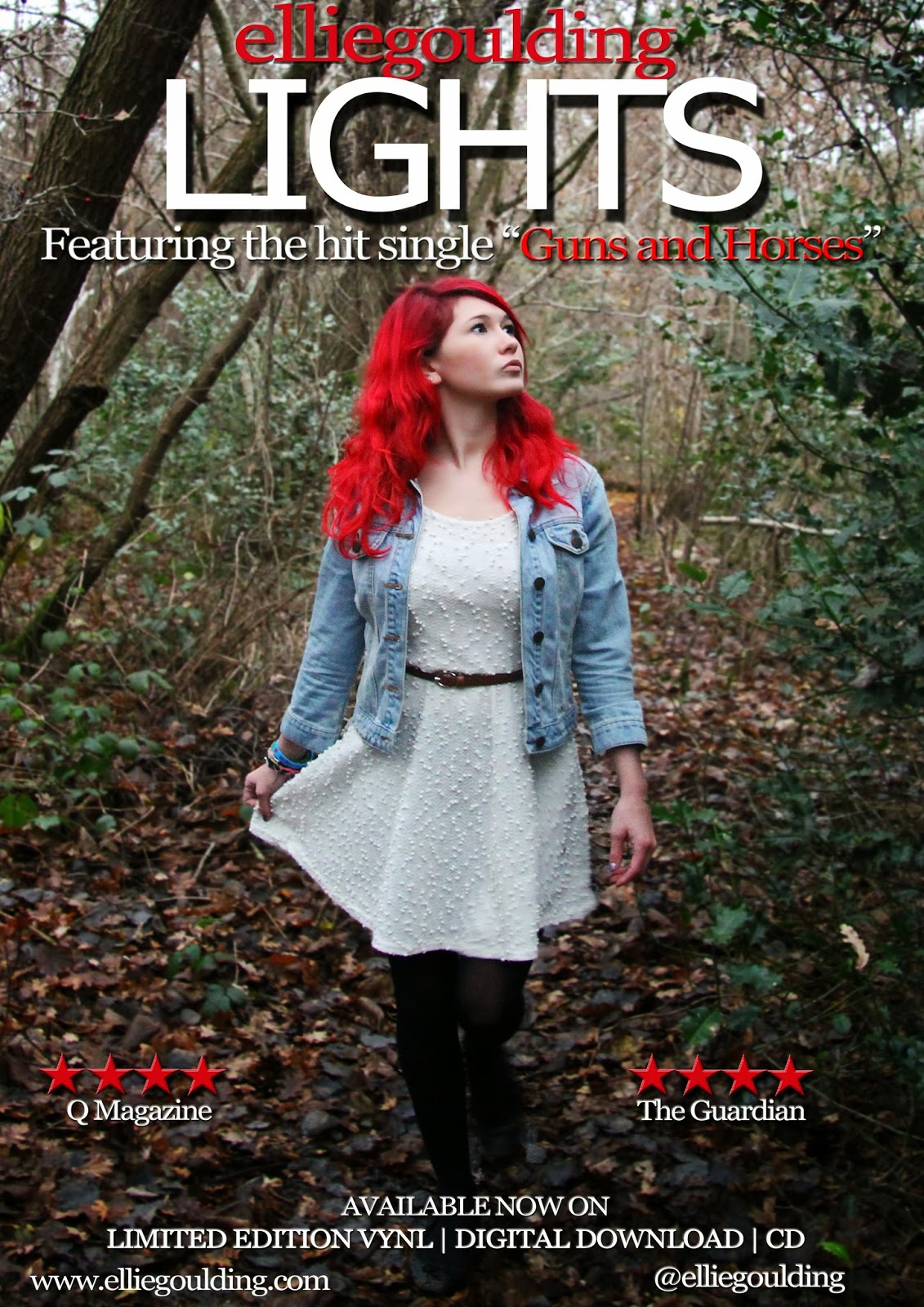
This is the final product of my album advert. As you can see, I have made many changes in comparison to my last draft. I showed my teacher and she told me that my second draft may have looked too much like a film poster, which I agreed with. So, I made many changes such as moving the album ratings down to the bottom of the page near the website mentionings etc.. I also changed the colour of the writing underneath the stars such as 'The Guardian' from red to white so that it would stand out more. This is because I figured that the red faded too much into the background which is the opposite effect from what I wanted. Furthermore, I moved the 'featuring hit single Guns and Horses' to the top of the page, above 'Lights', then I moved 'Ellie' and 'Goulding' down to the centre of the main image so that there was a gap between the writing to leave space for Ellie, and so that the font was small enough to fit in. However, I am not quite sure yet on whether I like this yet or not because I feel like it fades into the background too much and looks too 'random', but I am planning on receiving feedback from my target audience in order to fix this. However, my teacher thinks that it looks better like this so I will take that into account. Lastly, my teacher told me that my main image was too 'zoomed out' and even though I really liked the arch of the trees in the image, this needed to be cut out and the image needed to me zoomed in on because Georgina looked too small and far away, making it look like a film poster. I then realised that she wasn't the centre of attention on my album advert and that I definitely needed to fix this, so I cropped the image to make Georgina larger. I do think that this looks a lot better. However, in preparation for my final draft I will be changing many things, such as font size and type, the colours to make them stand out, amongst many other features.

However, after creating the third draft of my album advert, I made a few more changes. I changed the 'Lights' font to Tahomi instead, as I realised that using a Sherrif font previously was too old-fashioned and traditional, which I felt wasn't the look I was going for and the audience would appreciate a more modern, 'curvy' font. Furthermore, I felt the 'Ellie Goulding' text was too random right in the middle of the page, so I changed this font to Sylfaaen and made all of the words lower case, with no spaces in the middle. I then moved this to the top of the page, above 'Lights'. I also made this font red. I felt that the red and lower case text really contrasted with the white capitals with 'Lights'. As well as this, I moved the 'featuring hit single Guns and Horses' headline underneath 'Lights', and made 'Guns and Horses' red as it contrasted with the rest of the white text and I wanted it to stand out, as it's the title of the song. I didn't make any more changes than that, because I felt that I had received such positive feedback on my album advert previously and this was from my target audience, so I knew that I shouldn't alter what my audience like. 


This is a landscape version of my album advert, in which I decided to create when I had completely finished my portrait album advert and felt that I wanted to go just that bit further to perfect my coursework and get it to the best grade possible. I also created this so that I could place it into some advertisement/promotion technique images, showing the ways in which I could advertise my advert, and one of these was a billboard, which of course I needed a landscape version of my album advert for.
For this landscape version, I simply opened my portrait version and thought of ways in which I could adapt it to ensure that they are both similar, yet differ in various ways. Firstly, I dragged the same image I used in my portrait album advert onto my blank landscape document, resized it to half of the page, and dragged another one over, rotated it and resized this too. This is how I got the symmetrical, 'mirror' effect as you can see with the two images shown. I felt like I wanted consistency and fluency with my album adverts so that my audience could familiarise with them both and not feel that they are too 'different'. So, I simply dragged all of the text/features over from my portrait version, onto my landscape version, and resized them so that they were bigger and everything was symmetrical. This included putting the 'LIGHTS' in the middle, then putting 'elliegoulding' above it, and the headline underneath it. I did adjust some things however, so that the two posters were not too similar and almost 'boring', for example I used a different font for the title and headline. I also did not use a drop shadow on 'elliegoulding' or the main title, 'Lights'. I actually prefer this landscape version of my album advert as I feel it flows a bit more and overall, looks a lot more modern and pleasing to the eye. However, I am very pleased with the ending products of both of my album adverts.

Final Digipak

Front cover


Part 2 & 3 (CD holders)


 Part 4 & 5


Part 6 (track-listing)


This is the final product of my digipak. As you can see when comparing this version to my first draft, I've made many changes to it and improved it in many ways. My first draft's main image of Georgina is the the same one I've used here except before it was a lot more zoomed-out and blurry. When receiving feedback from my teacher, she told me that I should zoom in on the main image a bit more to get more of her face on show and therefore make it look more professional; also allowing the audience to identify with her more. So, I cropped the image, and then the teacher pointed out that the image looked too 'raw' and needed a filter on it which I agreed with. I had been planning to add some sort of different colour to the picture anyway as I knew it was only my first draft, but my teacher made me realise this even more so. I played around with different filters by going on the 'change colour' tab and 'adding blue' or 'adding red'. I found that I liked the image with both a blue and red filter on it, so it was difficult for me to decide. Therefore, I decided to make two different versions of my second draft which I knew I could then ask my target audience which one they prefer and also decide by myself which one I liked most. So as you can see, the first second draft of my digipak front cover has more of a 'red' filter on it which I thought really portrayed passion and love, in comparison to the second version which has a 'cold blue' filter to it which I also thought was effective because it made her face stand out and made her look innocent, which is exactly what my music video does. I didn't play with the main title too much as I liked the way it initially was, apart from enlarging it a tad. I also made the main image sharper so that it looked more professional. Lastly, as you can see there are some 'sparkles' placed underneath the first version of my digipak's title here. I knew that my digipak needed just something more to make it stand out, and I wanted it to appeal to my target audience as much as possible, so I simply googled 'sparkles', imported the image to my digipak front cover, selected the unneeded background on the image and removed it, then played with the opacity of the image and placed it underneath the title. I know it's quite blurry and not perfect currently, but it gives me something to work on in the future. Also, on the second version of my digipak front cover I realised that you can really see where Georgina's face has been 'cut out' as it is rigid and does not look professional, so this gives me reason to choose the first version as my final front cover after I've improved it. I didn't feel I needed to make many changes to the rest of my digipak for my second draft, however of course I will be for my final digipak. For my final digipak, I will most likely choose the first version of my front cover and maybe add a bit more of a 'blue' filter to the image as I prefer this, and there will be many other ways in which I will be improving it.
However in terms of comparing it to my second draft, I have changed a lot in my digipak because I felt that the front cover was too plain. I asked for my teacher's help and agreed with me that the front cover needed something else to 'liven it up'. We thought of many methods of doing this, and in the end, I changed the font into Gill Sans Ultra B... and changed the title so that it was all bunched together in quite a modern fashion. Therefore, the writing was more bubbly and 'full'. Overall, it just looked a lot more modern and less old-fashioned like before. I then changed the font colour by matching the ink colour to Georgina's hair, which is a purple colour. I felt that although familiarisation and consistency is important, I wanted the house colours to differ a little from my album advert, instead of it just being red and white. I felt the purple added quirkiness to my front cover and a bit more spark. Then, I realised that 'Lights' sidewise looked too orderly and it would benefit being diagonal instead, so I changed this. I kept the bevel emboss and drop shadow on it but removed the inner glow, as it stood out too much from the actual 'Ellie Goulding' title with this. Then, I searched for a Lens Flare and placed this at the top of 'Lights' in the corner. The little orange-coloured light really represented its title, 'Lights', and I found it added just a bit more spark to it, when it had originally been fairly plain. It also adds purpose to my front cover because it actually represents aesthetically what the whole music video is about, which I feel the audience will appreciate. Then I added a blue filter to Georgina's face to make it have a more 'cold' look, so that there was a glow to her face with an air of mystery. In terms of the rest of the parts of my digipak, I simply added a pale pink/red filter to all of the photos to ensure that the house colour theme is consistent throughout, and all the photos have a slight red tone to them. In result of this, the audience can identify and familiarise with them and the digipak will be more fluent. As well as this, I also took the drop shadow off of the track listing text on the last page of my digipak, as I felt it looked too unrealistic and fake. This made the text look more realistic and it blends with the background more. I also felt that part 4 of my digipak needed some sort of small text on it, as it was purely just an image of Georgina discovering the ribbons, so I added Ellie's twitter name @elliegoulding and her website to the bottom of the image on the right hand side, in small white text. I felt that this was a good way of marketing her social networking sites because the audience would feel she is 'just like them' with these sort of accounts online, and they are more likely to want to try and connect with her on this level. I also cropped the image a tad and zoomed in to it more, as I felt too much of the background was in it previously, when it needed more focus on her finding the props in the image. Overall, I am really pleased with the result of my final digipak.

Actor release form

Here are two actor release forms my two actors have filled out: Georgina, my protagonist actress, and Matthew, my male actor. I wasn't obliged to do this, however I felt that making my actors complete an actor release form would allow the audience to see that my actors actually wanted to take part within my music video. This adds more of a personal touch to my video as a whole, because knowing that the actors agreed to take part in and enjoyed taking part in my music video, would be a very appealing feature for the audience, and it adds personal identity.
 

Thursday 27 February 2014

Matching the house colour of my products: Screen grab


This is a video I have created through screen grabbing with 'CamStudio', capturing how I have strived to ensure that all of my products have a fluent house colour. The particular house colours of my digipak, album cover and music video is red, black, white and green, as they are natural colours. I have tried to extend these house colours throughout my products by for example (what it shows in the video), adding a slightly red/pink filter to the images in each part of my digipak. I think the effect of this is that the colours are subtle, as I do not want the images to look too tacky, unrealistic and colourful, but they have a slight hint of my house colours so that everything matches and my house colours are consistent throughout. I believe that this will create a sense of familiarity within the audience as they will recognise the colours fluently and then, hopefully they will go on to associate these colours with my three products.


Tuesday 25 February 2014

Evaluation: How effective is the combination of your main product and ancillary texts?


Transcript:

How effective is the combination of your main product and ancillary texts?

With regards to my music video, I feel that the technical skills used were very contributory towards its success, aesthetically, emotively and creatively. Understanding that my music video would essentially appeal to young girls within the ages of 12-24, I adapted different ideas along the way to ensure that it would both attract and appeal to this target audience, and match their exact expectations of what's considered a 'good' Pop music video. Firstly, the concept of my video was well-thought out. I didn't just want to make a 'cliché love story', but a story of a girl who is lost in her own entrapment of heartbreak, allowing the audience to actually follow her journey as she is constantly reminded of props that trigger flashbacks in her mind. The audience are actually shown these flashbacks, and they are not just random flash backs either. Each prop she discovers along her journey is actually a figure of her imagination, and not only this, but each flashback is a stage of her past relationship with her ex, Matt. I planned out the stages before I began filming, and these were: Stage 1. Just-met/dating stage Stage 2. Comfortable/in love stage Stage 3. Distrust/arguments stage Stage 4. Break-up stage Stage 5. Acceptance/moving-on stage. I decided that the total five stages would allow an actual simple structure for my audience to understand, giving it depth, and an equilibrium/resolution. I felt this was successful because I knew that most young females would be able to relate with the concept of being cheated on or arguing with a guy they held 'close to their heart'. Therefore, they would be able to empathise with her and understand my video on a much deeper, emotional level, which I believe is important. This is amplified even more by the technical aspects of my video, where I have used short shots that I matched specifically to each beat of the song so that it flows fluently to the rhythm. I kept the pace of the shots at a consistent rhythm until the climax of the song, where I flicked back and forth from many shots of Matt and Georgina arguing, to amplify the pain and anger experienced in this stage of their relationship through extremely fast-paced shots. I felt that this would suitably capture the reckless emotion portrayed not just in the song, but aesthetically too. I believe that this is another successful aspect of my music video because I think it has the ability to actually affect the audience emotively, as we (as the audience) are taken on a nostalgic journey, almost witnessing the couple's happy moments together first hand, for it all to suddenly break apart in front of us. Furthermore,

Evaluation: How did you use media technologies in the construction and research, planning and evaluation stages?


Transcript:

How did you use media technologies in the construction and research, planning and evaluation stages?

Initially, before any planning or research, I created a blog on www.blogger.com. This site allowed me to record every single element involved within the process of creating all three of my products. Luckily, I was familiar with this site already as I had used it in AS level Media studies. It was quite a simple concept to get a hold of so I found myself quickly adapting to it and posting different things every day. It proved to be extremely great in displaying my multimedia skills and portraying my work in a visually pleasing manner. It meant I could embed my tasks from different documents, whether it be Word, a video or Powerpoint, which was useful. I actually found myself enjoying using Blogger and beginning to post things I didn’t really need to, however I felt would help improve my grade. Blogger was essential to publishing my actual journey and how I improved on my producing process with every week. Additionally, Prezi is another site I was familiar with due to using it previously in AS. It is a web-based presentation application, which helped me present my work in perhaps more interesting and entertaining ways rather than just Powerpoint. This allowed me to actually vary the publishing techniques I used with my tasks, making them look more abstract and different. The embed tool on Prezi is what allowed me to copy my presentations on to my blog, so that it was easy to view every time anyone went on to my blog.
            Of course, to actually post videos to Blogger, I needed

Monday 24 February 2014

"Guns and Horses" - Ellie Goulding music video 3rd draft

"Guns and Horses" - Ellie Goulding A2 music video 3rd draft from Hannah Alley on Vimeo.


This is the third draft of my music video, in which I have made many changes to my last draft to improve it greatly. Firstly, I have colour corrected all of the shots by adding a long adjustment layer that goes through all of the shots, which I then added an 'auto colour' effect to. I found this made all of my shots a bit brighter and more pleasing to the eye, therefore more professional. I also added a shot at the beginning that pans down to the floor to ensure I not only have a variety of camera movement, but so that I could match the shots to the beat/Ellie's voice a bit more. To make my music video better, I have really taken notice of all of the feedback I've received and improving on the aspects/criticism mentioned. A prime example of this is when someone said that on one of the shots of Georgina's feet walking across the woods ground at the start of the video, 'her feet move too slowly in comparison to the long shots of her walking a little bit faster before and after this'. So, I increased the speed of this shot of Georgina's feet walking, to about 160%, and compared it with the long shots of her walking before and after this. I found that they now matched, and the scene looked a lot more realistic. Then, I added an adjustment layer to all of the narrative shots which essentially made them all brighter, and the contrasts a lot darker. I figured that the previous effect I'd added to the narrative shots was not effective enough; when I'd asked for feedback on the second draft, people had said I needed to colour correct some shots, which made me assume that the previous effect made the narrative shots look too dull and did not have the right effect/success, so I knew I needed to change this. The new effect I've added to the narrative shots ensures that there is a strong contrast between the performance and narrative shots, so that the audience can identify what are flashbacks, and what is not. The second feature I have changed in my music video is that I have changed the pace, cut and rhythm of the shots greatly. In the second draft of my video, some narrative parts matched the beat of the song and some narrative parts didn't. However I have changed this so that all narrative shots match the exact beat and rhythm of the song, and it is pleasing and fluent to the human eye. I did this by 'matching' each beat onto the timeline of my video, and cut each shot to this. This was quite difficult because I had to get each shot at the exact right time, which meant I even had to search for some more footage in my files and add more shots to perfect this. But I found the overall image really successful, as now, it flows naturally and matches the beat perfectly. I have also added a 'sharpen' adjustment layer throughout all of my shots, to ensure that all shots look professional and as sharp as possible. I found that the footage looked a lot better after I had done this, as according to my audience feedback, some shots were blurred, and I knew I needed to fix this.
Furthermore, I've added more interesting and quirky effects to my music video in order to ensure that it stands out and looks different and enticing to the eye. Sometimes 'love stories' in music videos can come across as cliché and 'the same', so I wanted to really avoid this. Therefore, at 00:56 seconds in when there are narrative shots displayed of Georgina putting on her coat and leaving her house to go and meet Matt, there is now an overlay of a performance shot of Georgina singing the lyrics displayed at that moment in time, which is faded into the narrative shot slightly. You can see the narrative shot more than this shot which is the idea - I changed the opacity of the performance shot so that it is slightly seen. I have also done this for about three other shots throughout my music video, either to represent Georgina's emotions - for example at one stage, I added a faded shot of Georgina looking down sadly, over the top of a shot of Georgina running through the woods - or to just show different aspects of the video and like I said, keep it interesting. I also did it to remind the audience that Georgina is still performing on the outside of this narrative.
Additionally, I have tried to make use of all of the footage I have taken to make my music video more interesting and varied shot-wise. Therefore, I added a shot about 01 min 23 secs in of Georgina's eye-view of what it looks like in the woods ahead of her. The camera is moving as if she is walking and the view is of her eye sight. I found this would be effective in showing her point of view, like I do with many other shots throughout the video. 
What I have also done is change the colour of the slow motion gymnastic shots in the video. Before, they were black and white, but the more I watched my video, the more I found the black and white a bit cliché and normal. I want to stay away from my music video being completely conventional and predictable as possible, so I changed the colour to a light pink colour instead. I did this ask light pink connotes love and passion, which is exactly the emotion Georgina conveys throughout my music video.
There's not a lot I changed about the climax part of my music video where all the shots fasten up, as they all originally matched the beat of the song as I tried to do this very carefully and accurately, as well as the fact that this was the specific part I got a lot of positive feedback on in my survey. I felt that if I made too many changes to this, it wouldn't be what my audience wanted, so I left this.
However, the ending part of my video I really did change. For starters, in the shots of the letter being found and then burned, I colour corrected these with a 'colour curve' effect and increased the green and red curves in the shots, as I found they looked better this way and they also conveyed a more passionate emotion. Then, after receiving the feedback that the ending of my video was too confusing with Georgina smiling happily as she sung the last lyric of the song, I completely changed this. I agree that it was contradicting as throughout the whole of my video she'd been sad and heartbroken, whereas at the end she portrayed the complete opposite of this. So I replaced one of the shots with a slow shot of the camera panning across the ashes left over on the floor from her burning the letter, and sped it up a bit, and then left the shot of Jess' gymnastics in black and white as I found it more memorable and meaningful this way, and then I added a close up shot of Georgina looking sad, so that the audience could finally empathise and identify with her. Then, on top of this I placed a shot of Georgina and Matt standing in a field cuddling together, as their last moments together. I made this black and white so it had a sentimental affect, and changed the opacity to about 30% so that it faded into the close up shot of Georgina looking sad. Therefore, the two shots were very contrasting as Georgina's hair is colourful and bright red to signify passion and pain/anger, in comparison with the sad, black and white shot of the couple's last moments together. I found that this was the perfect final shot for my music video as the merging of these two pieces of footage gave off the effect of the audience actually knowing what Georgina is thinking about in this final shot of her looking sad, because it is represented faintly on top of her - reminiscing of her and Matt happy together. I actually found this shot of Georgina and Matt right at the start of the footage I'd taken for my music video, when I was filming Jess doing her gymnastics. The purpose wasn't even to film Georgina and Matt at this stage - I was actually filming Jess practicing her gymnastics - yet I just happened to pan over to Georgina and Matt cuddling together. Therefore this was actually a natural, unplanned shot that they happened to be doing without us even organising it, which is the more touching part for me. I therefore wanted to incorporate this into my music video, because it's also a different scene; the wide field they are in represents the more happy, freedom-filled days the couple had together when they were in love.
Overall, I am pleased with the final product of my music video, however I will add changes to it in the future. For example, I know that the end of the video needs to go on for longer as it finishes quite abruptly, when really I want the sad effect to prolong for just a bit, so it can slowly fade out. I only realised this once I had published the video. Furthermore, I need to fix some shots in terms of colour correction as some of them flash into different colours, and also I haven't added the same effect to every narrative shot, so I definitely need to fix this. I have also noticed that there is also a slight delay at the start of the music video with miming, when Georgina is first walking towards the ribbons (which are not seen at this stage yet), so I will fix this too.

Sunday 16 February 2014

Evaluation: How have you used, developed, or challenged Conventions of Real Media texts?


Transcript:

Evaluation: How have you used, developed, or challenged Conventions of Real Media texts?

Each media text adapts certain typical conventions according to its genre, such as pop, rock, R&B etc. If you watch a variation of music videos, you will realise that they all cater to certain genre conventions, which are repeated over and over until they eventually become familiar to an audience. However, you could argue that some artists like Gaga for example, essentially have their ‘own genre’, as Gaga is so unique in so many ways.

Music video

My music video uses a pop song, so when it came to producing it, I knew I needed to decide whether to conform to fixed pop conventions, develop them or challenge them. I ended up wanting to have a contrasting balance of both challenging and using pop conventions, which was very fun to do. Firstly, my video definitely conforms to Goodwin’s ‘Dancing in the Distraction Factory’ theory, stating that there is a relationship between lyrics and visuals firstly. I definitely do this, as for example, when Ellie Goulding sings ‘I left my house, left my clothes’ I correlate this with footage of Georgina putting on her jacket and leaving her house. I made sure to repeat this aspect quite a few times to represent familiarity, but not too many times for it to become repetitive and predictable. Secondly, my music video really conforms to the idea that there’s a ‘relationship between the music and visuals’, as I made sure to match every single shot to each beat of the song with the ‘marking’ tool, so that the rhythm and pace was consistent and easy to watch. The second draft of my music video however, did not have this and watching it back/receiving feedback made me realise it really did need short, snappy cuts to match the song rhythm, so of course I changed this. The lighting on the “happy” shots of the couple’s first date and their comfortable/inlove stage are high key, to represent happiness and lightheartedness which is what many pop music videos replicate. However, when things start to go wrong and Georgina gets rejected, the lighting instantly becomes low key and shots fasten up to represent her frustration and overwhelming emotion. Also, as Goodwin stated,

Saturday 15 February 2014

Evaluation: What have you learned from your audience feedback?


Transcript:

Evaluation: What have you learned from your audience feedback?

Gathering audience feedback was a prime element of the production process of my music video, as it informed me on what sort of thing I need to improve on in order for me to reach the best grade possible. It also showed me the generally favoured elements about my music video, which highlighted to me what conventions my target audience appreciated as a whole. It also ensured that I was creating products that would appeal to my target audience successfully and be of a high professional quality.
The primary target audience I have chosen for my music video is mainly teenage and adult females between the ages of 14 and 30, as they will most likely have experienced or witnessed what my music video focuses on at least once in their life: heartbreak/relationships. Furthermore, due to Ellie Goulding being quite a young, angelic & popular artist that younger female audiences will most likely be aware of, a female target audience seemed appropriate. This is adding onto the fact that the Pop genre is more well-known within the younger generation. I represented all of these elements in my products by making them feminine and pretty/naturistic. Examples of this are the light star/twinkle effect I applied to a photo on my front cover digipak, or the narrative in my music video following a female on her journey – allowing audiences to personally identify with the character. The secondary audience of my music video would be males between the ages of 17 and 25. This is because I’d assume that less males would be interested in my music video because the concept is quite feminine.
I made sure to gather all the audience feedback I could, all the way through the production process of all my products. Before beginning the whole process of production, I created and handed out a questionnaire to my Media class mates which asked questions like “would you prefer a music video with narrative and performance? Or just performance?” This allowed me to collect both qualitative and quantitative data, which was really useful. As well as this,

Friday 14 February 2014

Summary of raw performance footage


This is a video I have made on Adobe Premiere Pro, including a summary of all the footage I had taken for the performance side of my music video. I summarised each part bit by bit, explaining what each shots were used for, as well as explaining why I used one shot and didn't use another, the shots I didn't use with their explanation, and more. I found this task really insightful because it made me realise how much footage I had and how much effort had been put into it, and also why I hadn't used some shots. It definitely reassured me that I had chosen the most suitable clips for my music video, which was good. As you can see by watching this video, it only contains a summary of several different shots as my aim was to not bore the audience with a range of random, tedious footage. I have used the main feature of personal identity by keeping the audience engaged through mainly using shots that contain my main protagonist, as she is the focus of my music video - not other irrelevant aspects. I hope that my audience will maintain their interest by having some sort of relation to the artist. Furthermore, I adapted the footage on Premiere consisting of speeding up some footage, cutting some parts and adding captions to allow the audience to be able to identify each part, so that again, they don't bore easily and feel as if they are watching the same thing over and over. Lastly, portraying a range of footage allows the audience to feel as if they are part of a journey, directly watching transitions from each shot to shot and how all the scenery varies.

Thursday 13 February 2014

More alterations made along the way: adding the last clip


This is a document I have made, explaining an alteration I have made to my music video recently, in preparation for my final version.  This includes me basically altering the last few clips of the video and replacing them with other videos, as it explains in the document; the whole process was really invigorating because I felt like my music video looked tons better after I had done this. The document basically explains this whole process, and how I think it will effect my music video/the audience. It also includes a screen grab of the process on Adobe Premiere Pro.

Results from survey on the second draft of my music video


Here, as you can see I have analysed the data I have collected from the results of the survey I created based on the second draft of my music video. I handed the survey out through many methods such as social networking sites like Facebook and Twitter, or asking family and friends to fill it out. I find the results put into a bar chart here very interesting because it summarises for me how much improvement I need to make and overall what people think of my video. I also noted how the majority of people said that the shots of Jess doing gymnastics were unnecessary, which has encouraged me to perhaps remove his footage to suit my target audience. There is a lot I can learn from these results.

Tuesday 4 February 2014

Project log 04/02/14 (progress on my products)

At the moment I am working on fixing my blog and making sure it is up to date and organised. For example, I have added descriptions where they have been needed on certain documents I have uploaded onto my blog, like the drafts of my products. I realised that for some, I hadn't explained properly what changes I had made to them and how I plan to improve them, so I did all of this today. Also, whenever I've been in school I have been working on all of my products; especially my music video and digipak. On my digipak I re-did the sparkles underneath the masthead to make them less blurry and look more professional, and I changed the filter of the main image a tad, to the one I liked best. Also, on my music video I have been working really hard to shorten shots down to make them suit the pace of the song more and be less tedious to watch. To do this, I set 'marks' on the timeline of my music video to basically mark each beat of the song to end each shot to, so that it has a good pace and rhythm. After watching each part I'd done back, I noticed it looked so much better to watch and a lot more professional. I realised that too many of my shots were too long, so I've definitely changed a lot of this and will be doing more so as I go on. I have also changed the filter on my 'gymnastic black and white shots' into a subtle light pink filter. I believe this looks so much better as the light pink is a lot more subtle and professional, and also pink connotes passion and love, so it represents very well. In my eyes sometimes black and white is too corny and doesn't look very professional, so I knew I needed to change this. I will be continuing to work on all of my products throughout the week. I have also started one of my evaluation questions, so I will be continuing to work on this too.

Sunday 19 January 2014

Contact sheet for my album advert/digipak photos

This is the contact sheet I created with all of the images I took for my album advert and digipak in Ruislip Woods. I created this contact sheet on Photoshop. I found that it was a useful tool because it summarises all of the choices I had to use for my products and the creative ways in which I made Georgina pose, or the scenes I used etc.. I found this very insightful. The majority of the photos were used for my digipak and album advert as this part of my coursework required still images rather than moving footage.
Similarly, another benefit of displaying all of my photos in this format it's essentially showing the audience all the other photos I had taken that I wasn't able to use in my still-image products. This almost adds a personal touch to the whole process of my products, because it's taking the audience on a journey and giving them an actual insight into what photos I have taken and what ones I have and haven't used. This almost acts as a secret 'behind the scenes' idea, that the audience can enjoy and view. Additionally it also illustrates different angles and shots of the same photo displaying different interpretations of the same thing.

Thursday 16 January 2014

Peer assessment/feedback of the third draft of my music video


Today in class, we showed our music videos to the class and asked our class mates questions. I received a lot of positive feedback which I was pleased about, but I also asked for improvements/constructive criticism which in turn I was told that I needed to make some shots less blurry and colour correct a few. Overall, I was happy with this feedback as it made me realise what features I needed to improve on to finalise my music video to its best possible stage. Also, I was able to receive opinions from my actual target audience as they were the perfect age for my audience, so I knew the opinions were really valid and helpful. I will be using all of this feedback to its full advantage.

Project log 16/01/14 (analysing the results of my peer assessment)


Transcript:

Today in class, we all had to present the first or second drafts of our music videos. Then, we had to ask a few questions to our class members. I asked questions such as “what did you make of the narrative of my music video, did you understand it?”, “did the mise-en-scene suit the genre of the song?” and “what are some potential improvements you could give me?”. I received feedback from Ciaran for example, who said that my music video was really understandable and the narrative was clear. Then, we handed out sheets which everyone had to fill out. They asked questions based on the editing of my music video, the filming etc.. My peers had to give me a level on each of the aspects given, which was based on a level sheet which states what each level means. Some of the constructive criticism feedback I received was that I should cut some of the shots more as some of the shots are too long and that I should fix the blurry shots, and that I should also colour correct some shots. However, some positive feedback I received was that the narrative was clear and that the mise-en-scene fits in well with the genre for example. I was really pleased with the feedback I received. Then, I received feedback from my teacher, who said that she really liked my music video and that the narrative was clear and fluent; however the only thing she’d change is the ending shot where Georgina laughs and smiles on the last lyric. She said that this confused her as the majority of the music video consisted of Georgina being upset, and that the whole video made sense apart from this shot, so I should change it. Ciaran said that I should perhaps fade the last shot into white. I will definitely take all of this advice on board and I would say that this feedback session has really helped me as I have the feedback on paper and can refer to it whenever I like which will really help me in making my music video the best I possibly can. I plan on putting all of this data onto a pie chart soon so that I can summarise my feedback properly.

Saturday 4 January 2014

Audience feedback survey (and how I handed out my survey)

PLEASE TAKE MY AUDIENCE FEEDBACK SURVEY: http://surveymonkey.com/s/LFVBRM5

Create your free online surveys with SurveyMonkey , the world's leading questionnaire tool.

With Survey Monkey, I created a survey asking 10 questions I believe would help me improve my music video. I have used many different methods of getting my music video target audience to take the survey in order to give me sufficient audience feedback.

To get a good amount of survey responses, I used social networking methods such as Facebook:


All of the Media Studies students put together a Facebook group conversation and we decided to send the group our individual surveys with the videos, so that we could all watch eachothers music videos and fill out eachothers surveys to help eachother. I thought this was a great idea as we are able to get feedback from fellow Media students who actually know what they are talking about and can understand perhaps more "Media-suited" questions, such as ones about camera angles etc. Also, this means I'm getting sufficient feedback from my actual target audience.

I also set a status on Facebook:


I also used methods such as Twitter:


As you can see, I set a status asking people to fill out my survey. I feel it is unlikely that tweeters will take the time out of their day to fill out a survey they are not that bothered about realistically, however I felt that it was necessary to get as many responses as possible, and it is worth a try. It's also good to get feedback from people who are out of the Media A level circle and see what their view is on my music video.


I also texted a few of my friends and told my family about this survey. I found that all of these methods were well-suited and successful, as even though some of my family are not my target audience, it will be useful to get opinions from varied age groups.

Social networking sites like Facebook and Twitter are of course very useful for surveys, particularly for me, because they involve mainly the people who are my target audience, so it's a perfect way to hand out my survey.


I am currently awaiting responses for my survey. So far I have 7, and I'm hoping to have near 20 by the end of next week.